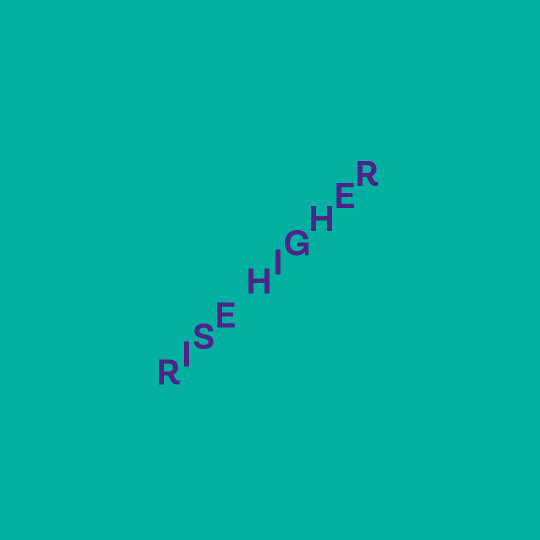
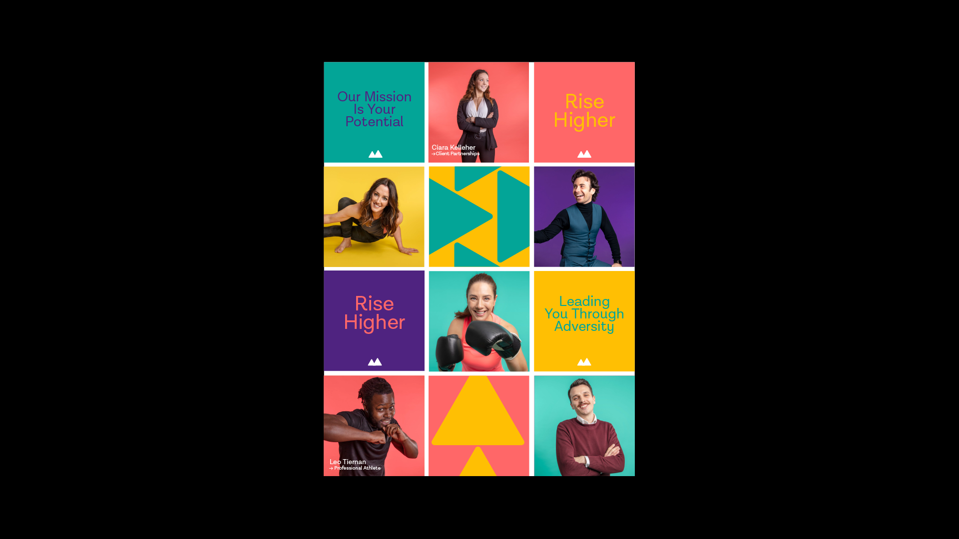
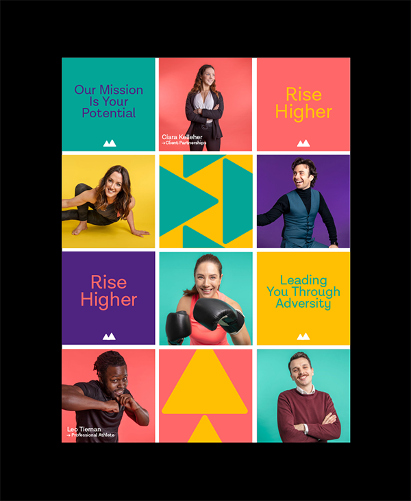
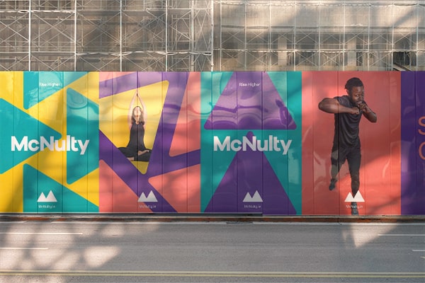
The original McNulty brand identity was aggressive and impersonal. We set out to create a more open and welcoming brand with a global reach. One that was both approachable and empowering.
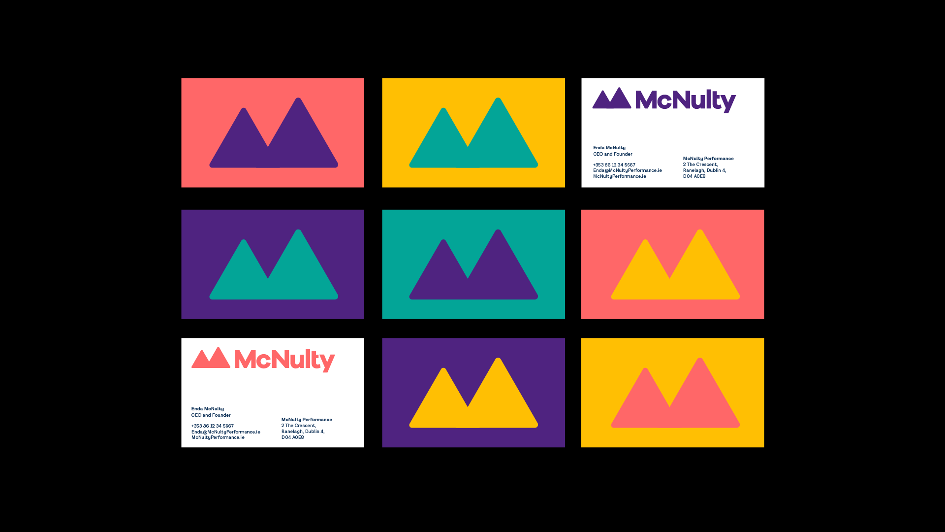
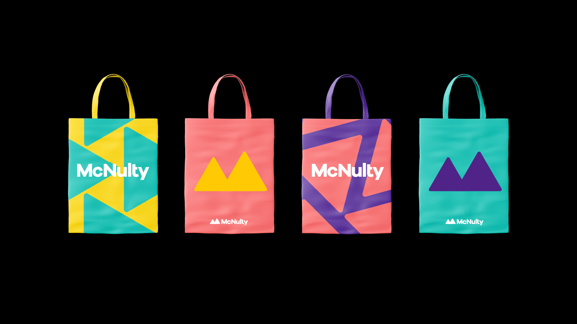
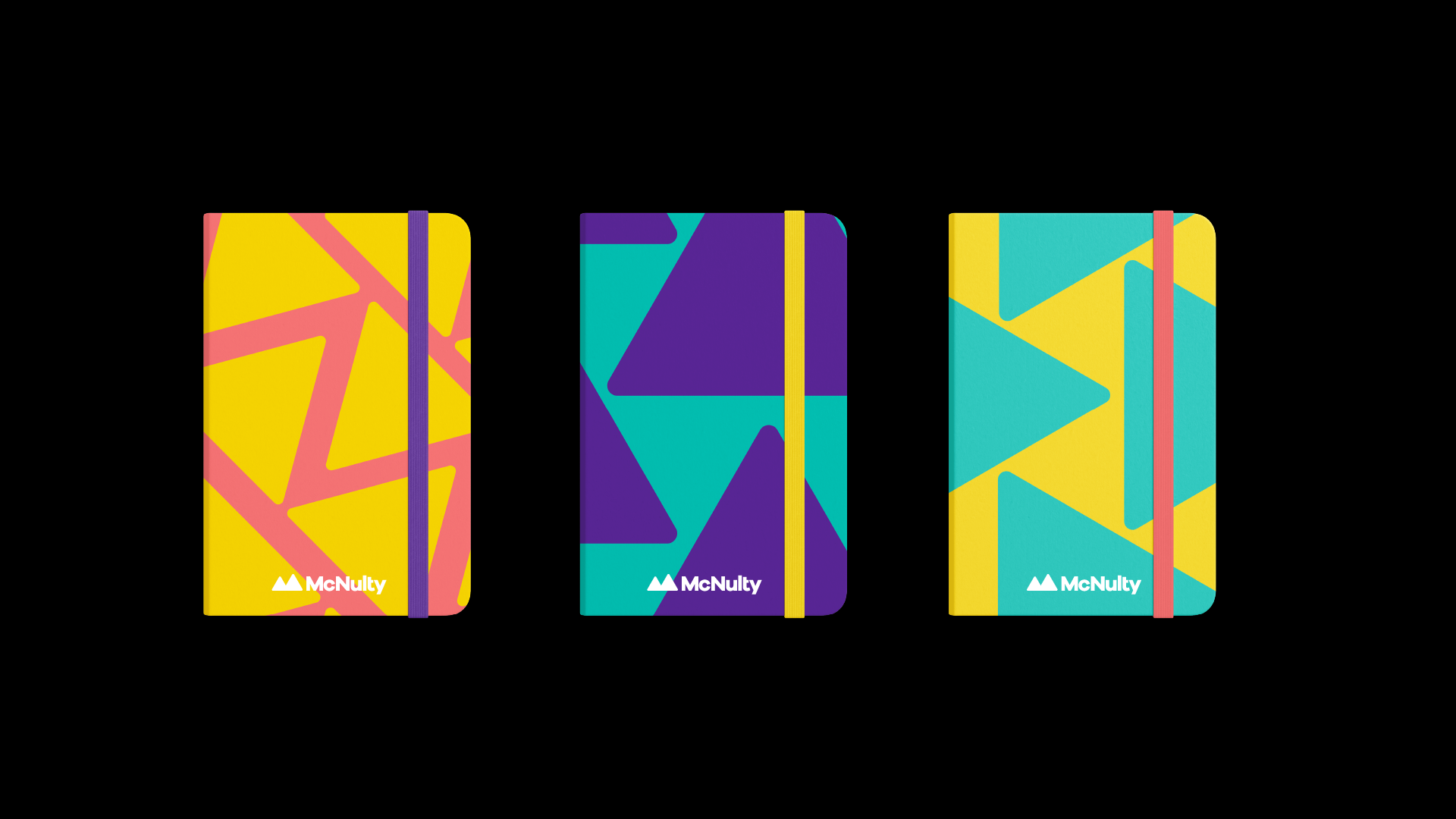
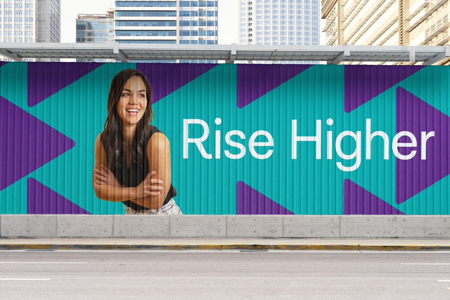
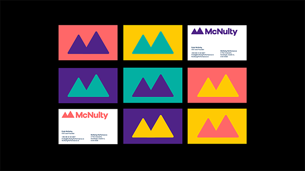
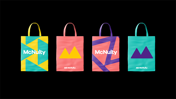
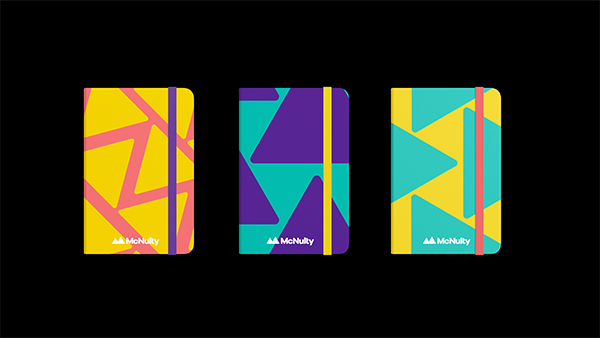
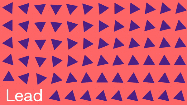
Inspired by CEO and founder Enda McNulty’s childhood climbing Slieve Gullion, the logo takes the form of an ‘M’ by placing two mountains beside each other. The second peak is taller than the first, signifying our ability to overcome challenges and grow for the next. When the logo is separated we are left with two triangles. These triangles are then used to create encouraging and confident patterns. No mater what way a triangle is rotated it will always point in a positive direction.
Date: 2020, Created at The Tenth Man
Creative Direction: Richard Seabrooke
Photography: Derek Doyle