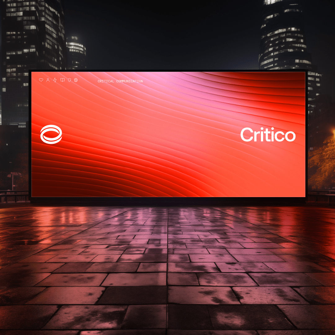
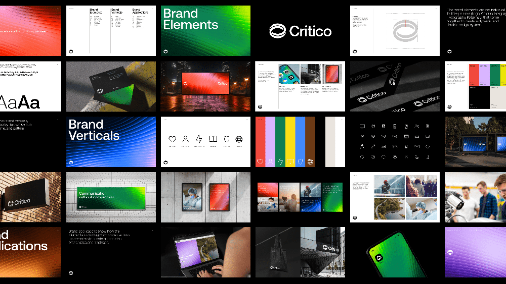
Critico is the product of a unique vision. Two great companies, PageOne and BP Multipage, now working together as one. Providing their customers a better range of critical communications solutions, while giving them a higher level of quality and service. 24 hours a day, 365 days a year. This transformation reflects not just a change in name, but a bold step forward in aligning their brand with the diverse and cutting-edge range of technologies and services they now offer. I was tasked with creating a brand identity that encapsulates this innovative proposition.
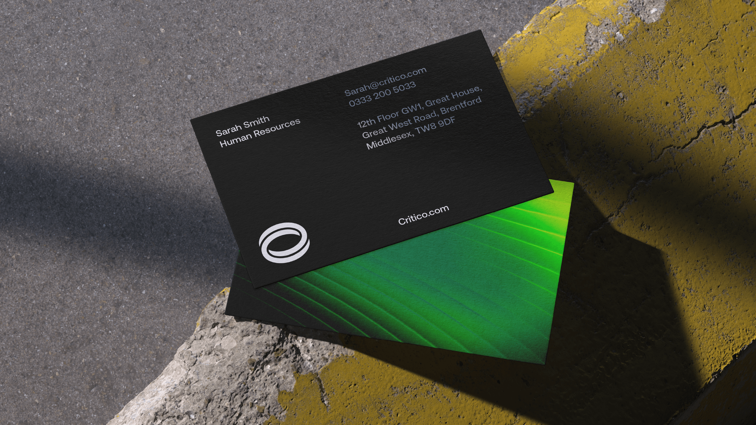
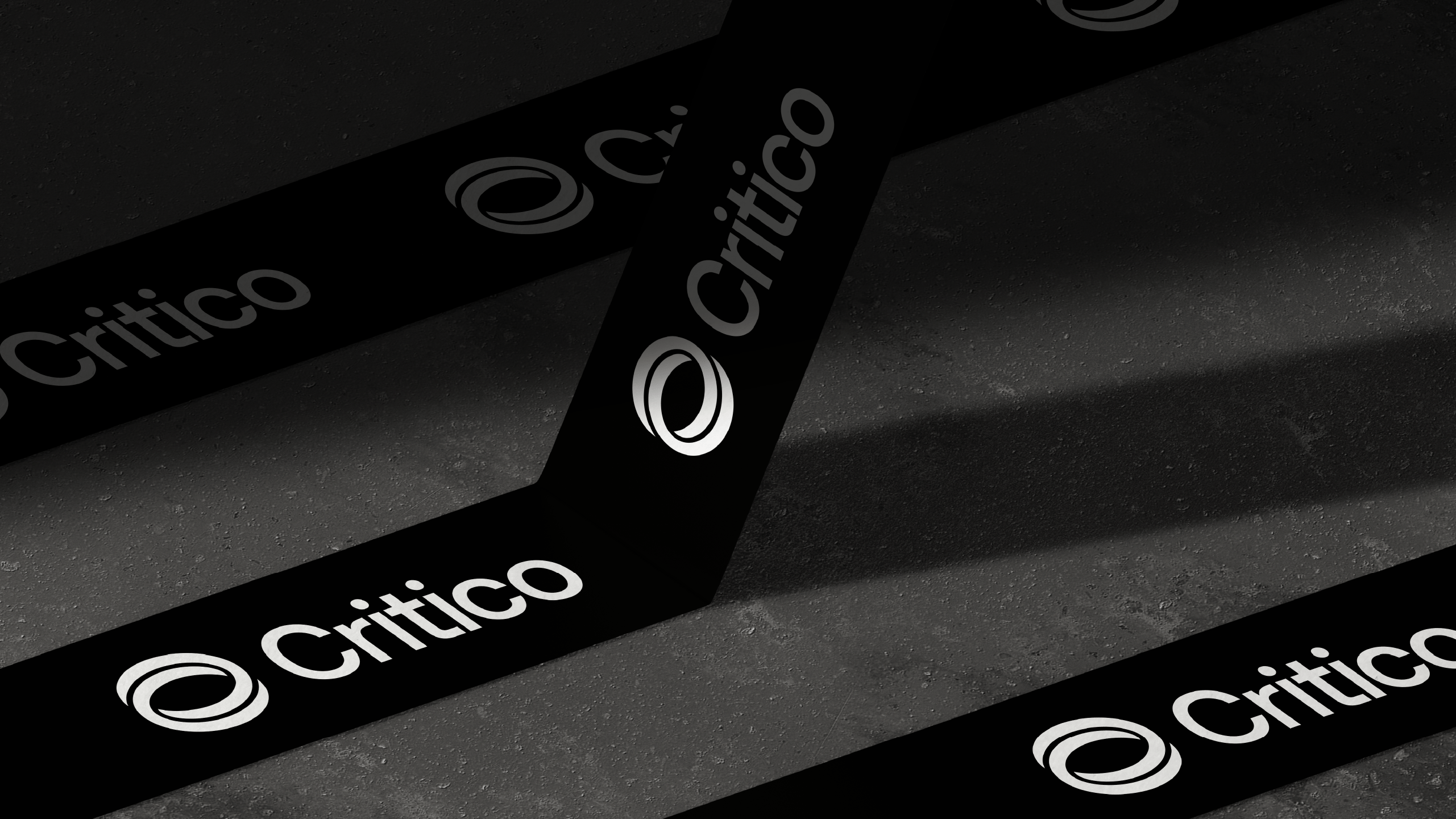
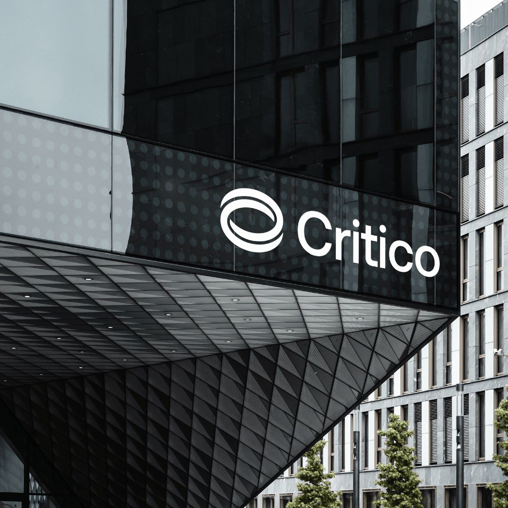
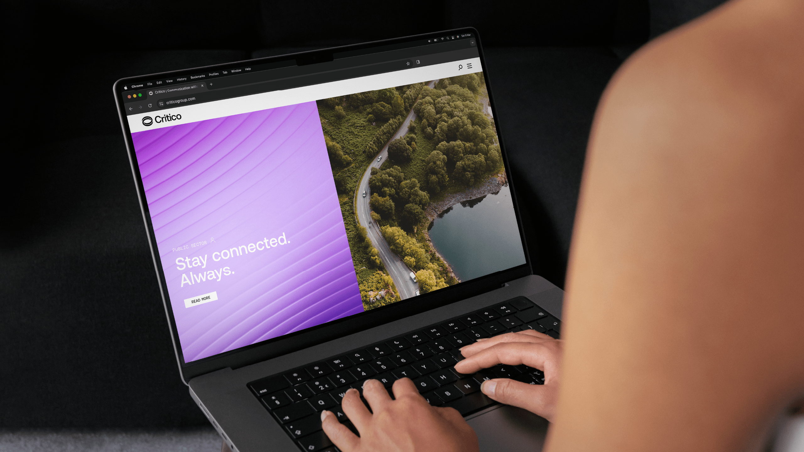
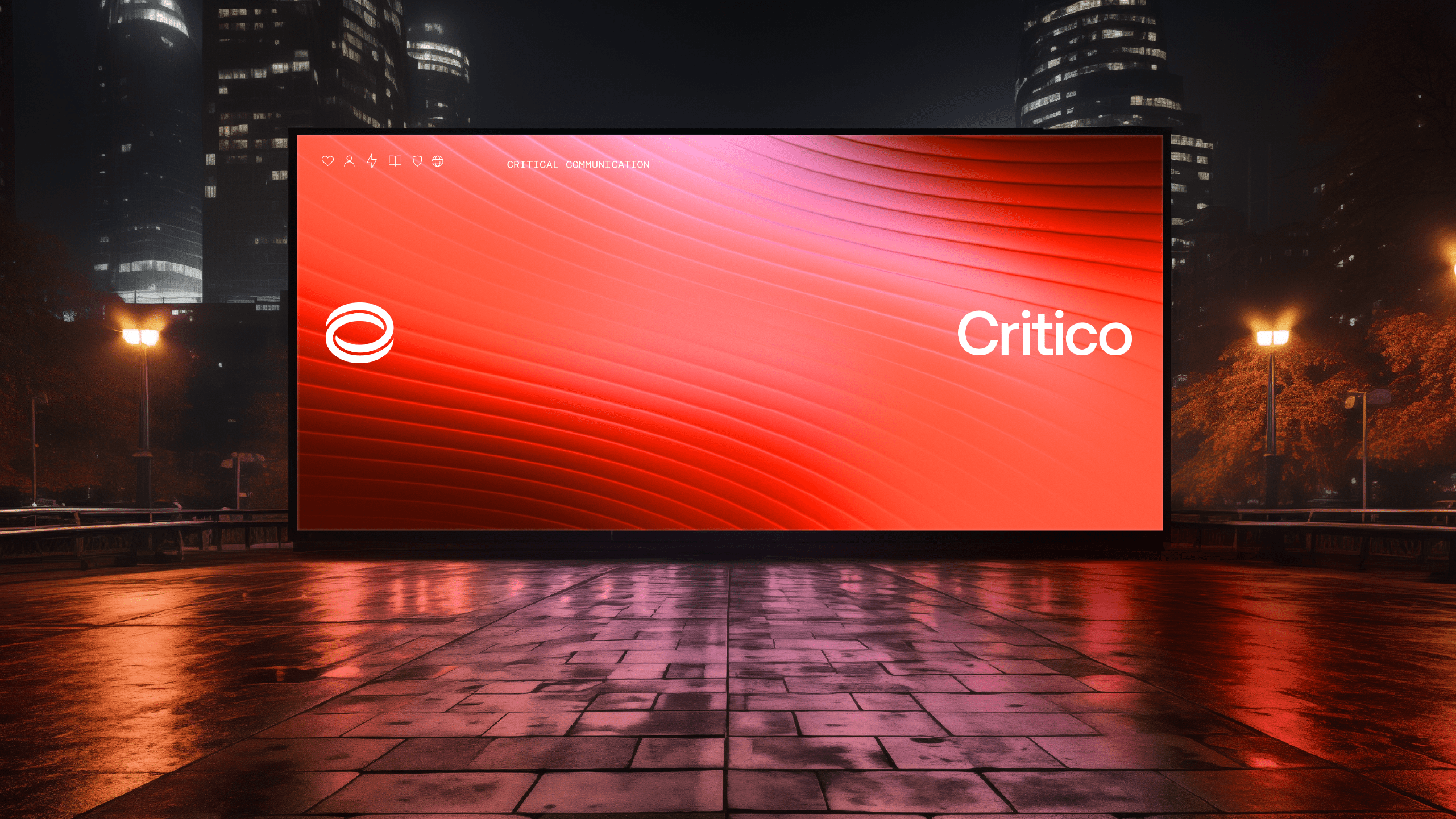
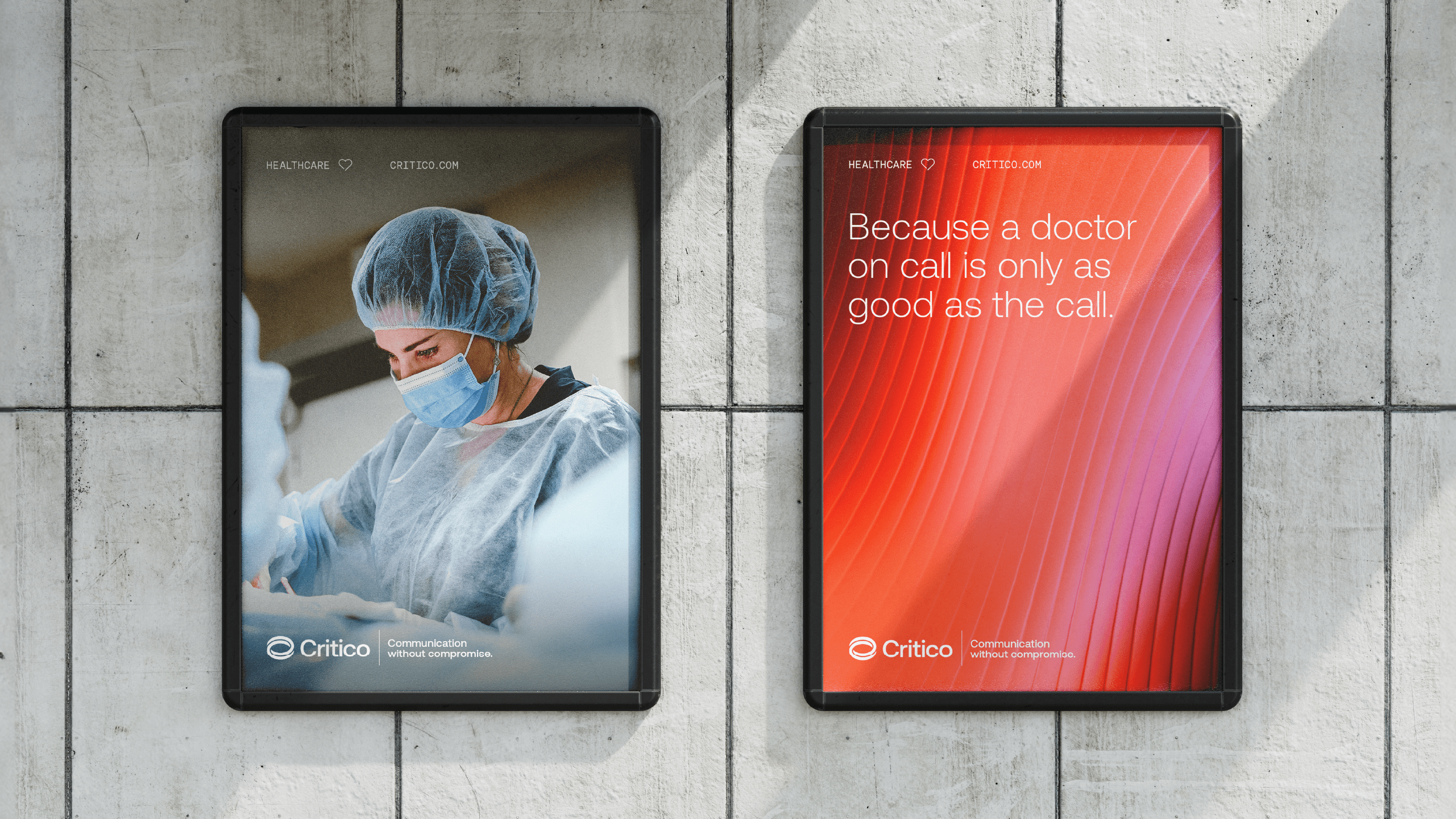
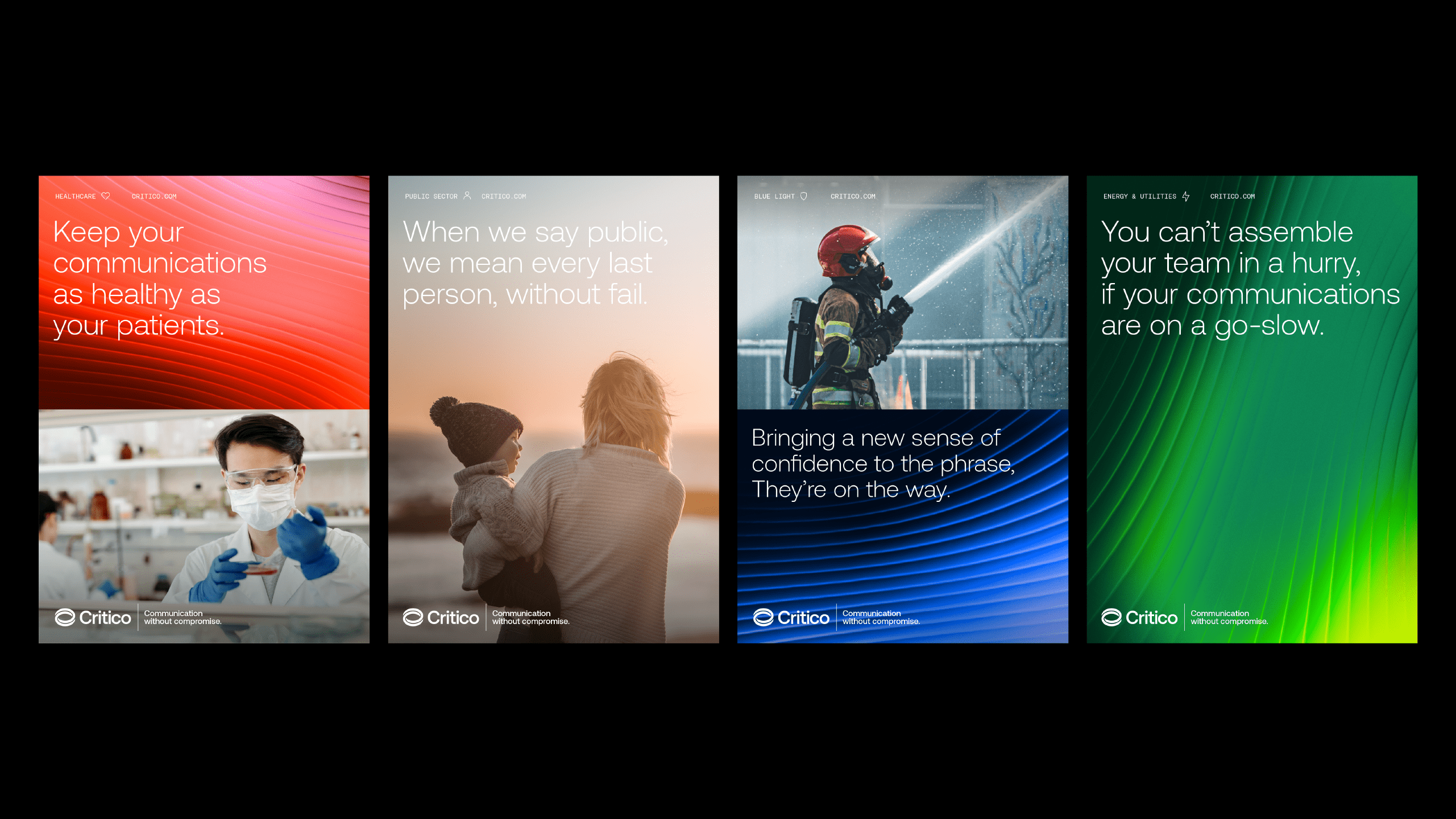
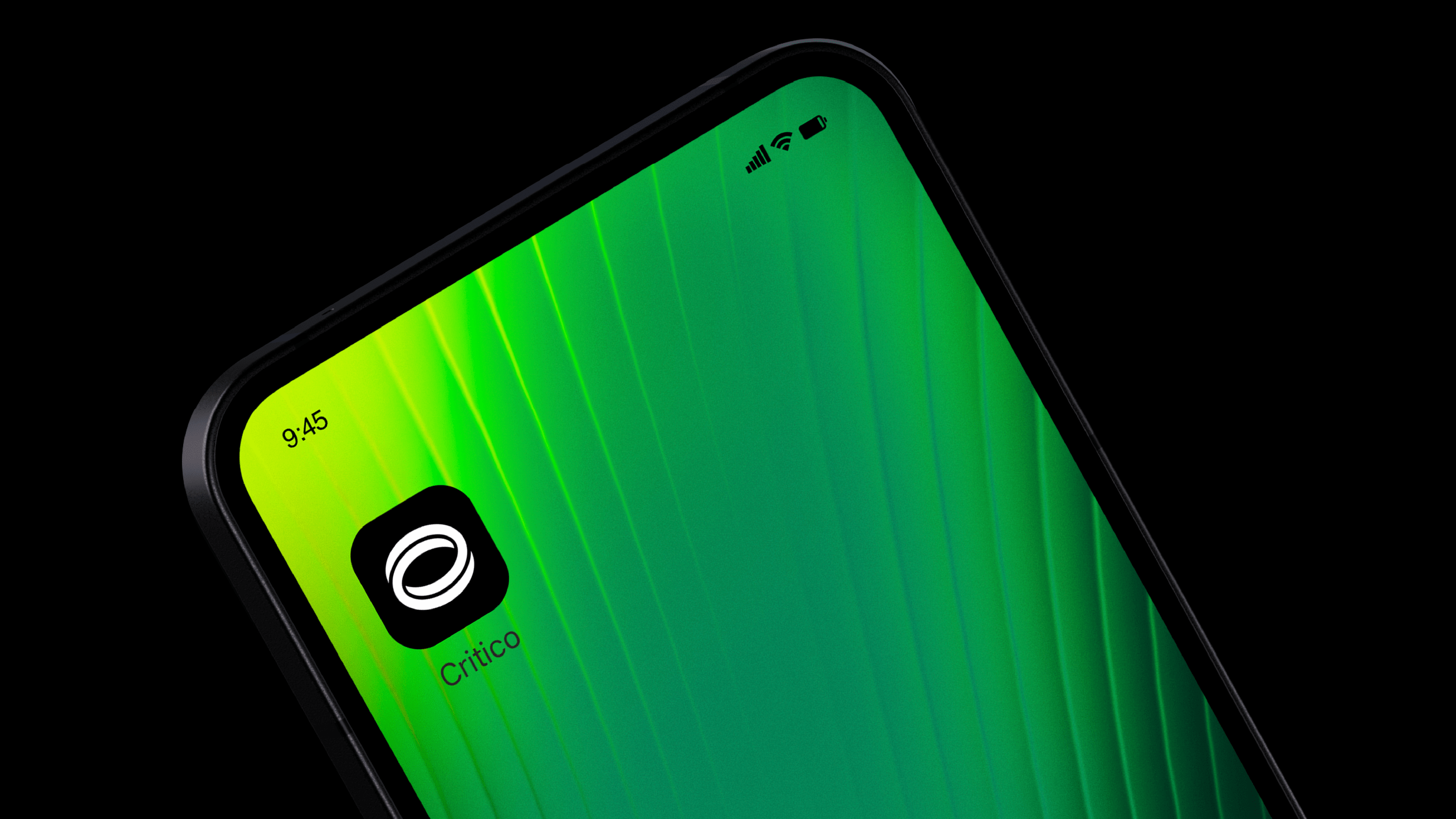
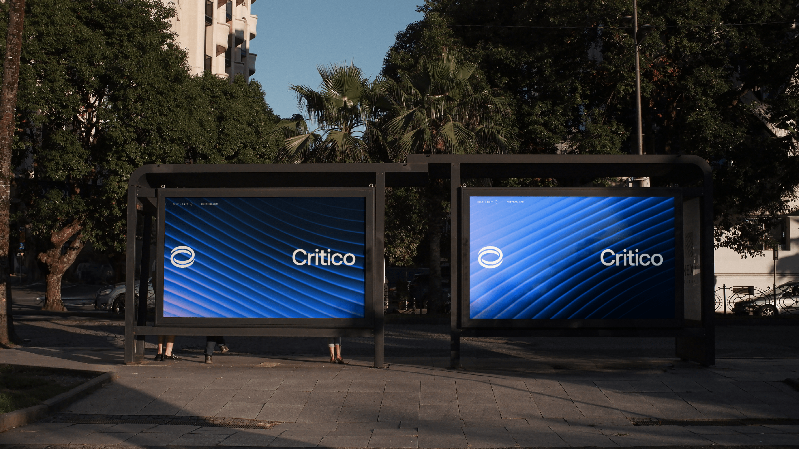
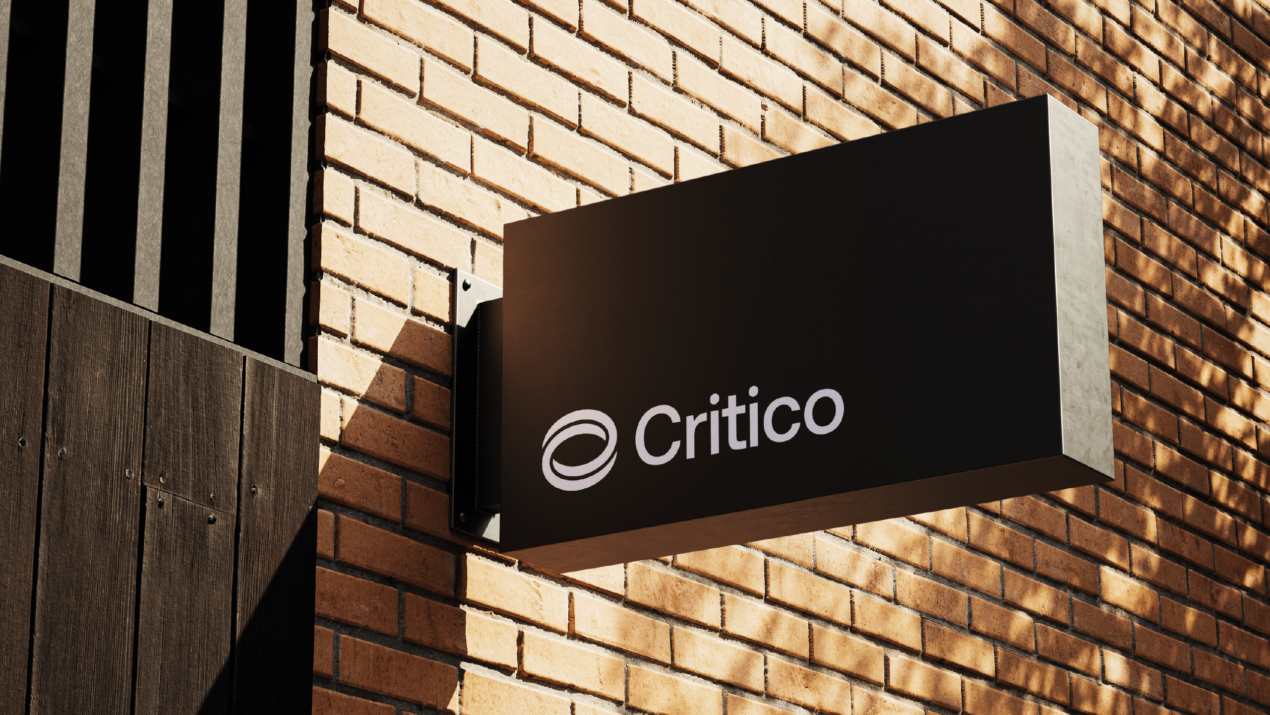
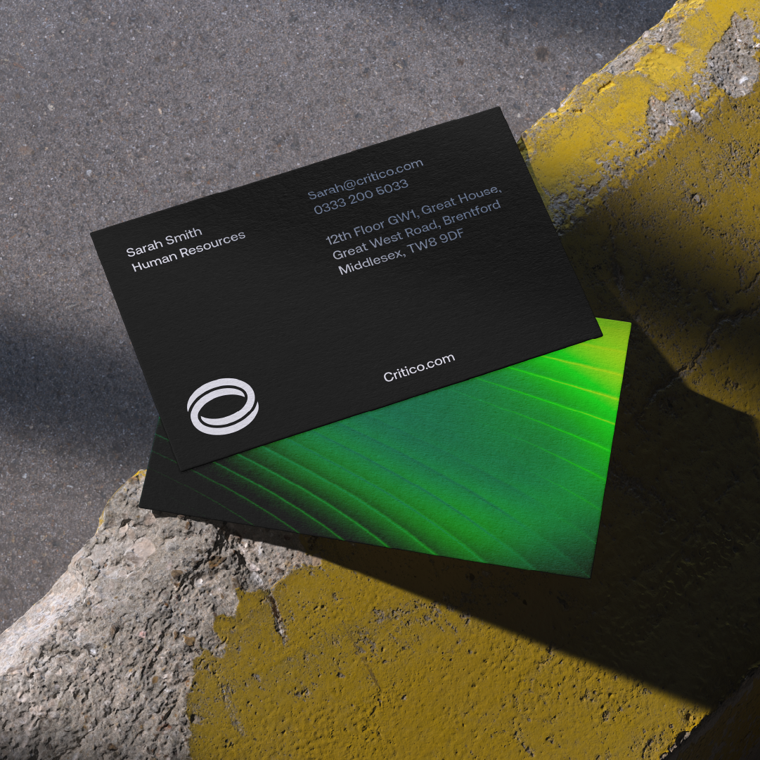
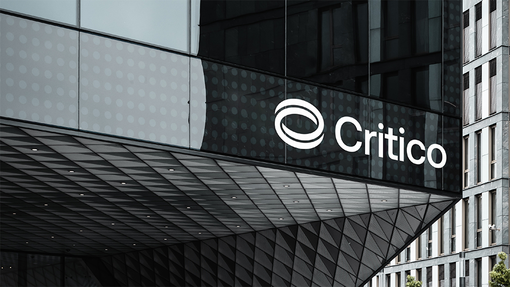
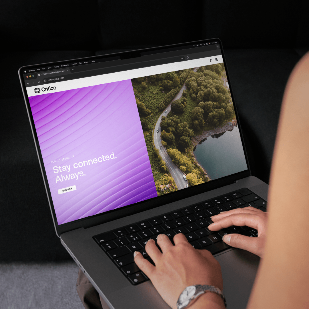
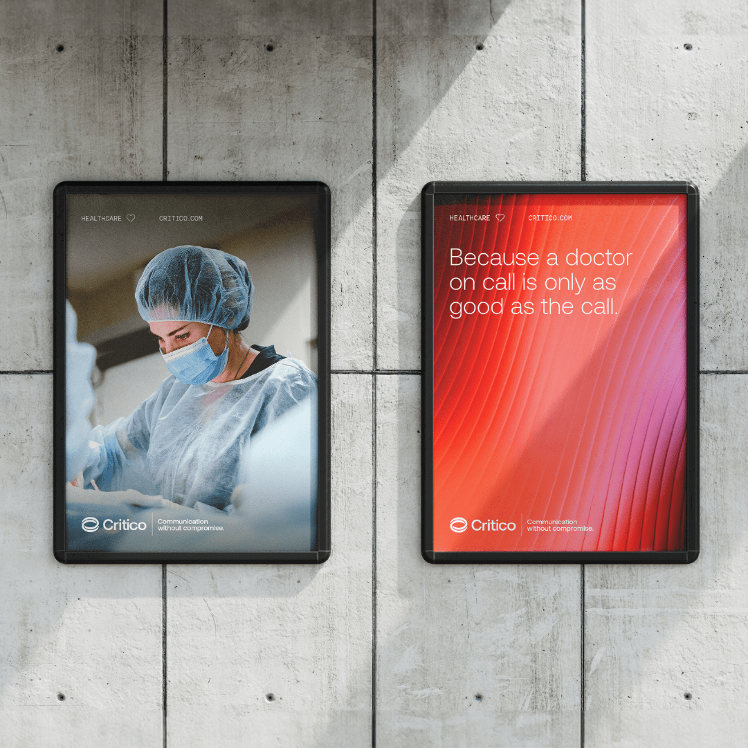
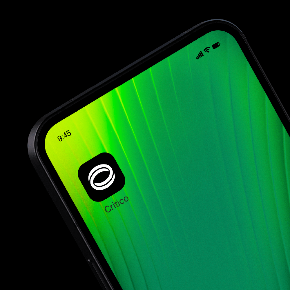
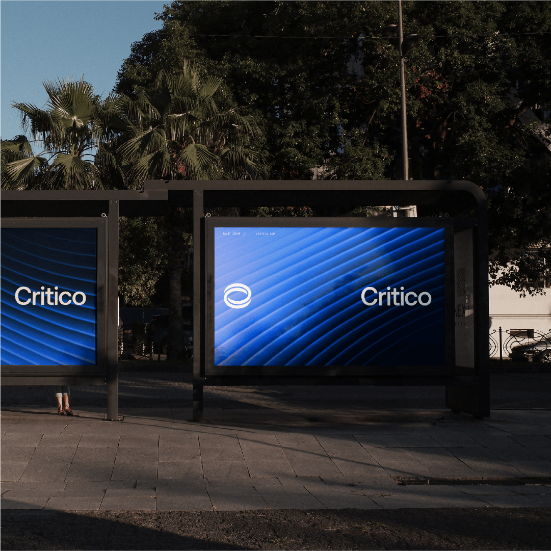
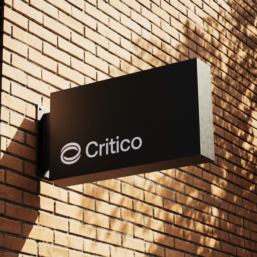
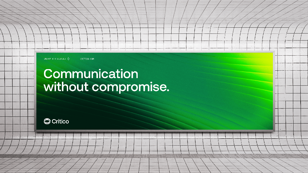
The new logomark comprises a pair of interlocking C’s, echoing the fusion of "Critical" and "Communications" in the new name, Critico. It symbolises connectivity, dependability, and cohesion.As a business, Critico operates across six distinct sectors, each distinguished by a unique colour palette, icon, and pattern. These abstract patterns depict the fluidity of communication. Additionally, motion is integrated throughout the new identity system, reinforcing the brand's forward-thinking ethos.
Project completed at So Studio.
Credits: Creative Strategy & Copy by Karen O'Neill & Michael Mesbur
Disciplines: Brand Identity & Motion
Date: 2023